


| Source: Date: Updated: |
Chart of the Day
Friday, July 19, 2013 Friday, July 19, 2013 |
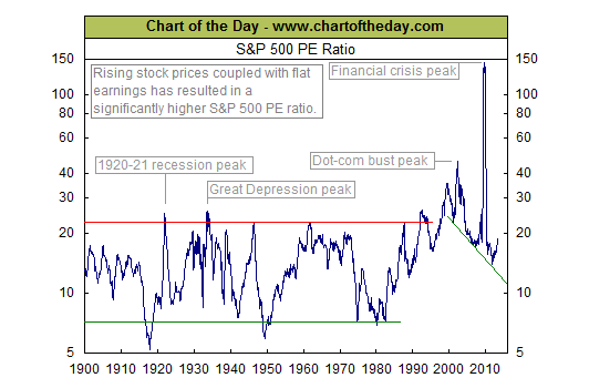
Today’s chart illustrates the price to earnings ratio (PE ratio) from 1900 to present. Generally speaking, when the PE ratio is high, stocks are considered to be expensive. When the PE ratio is low, stocks are considered to be inexpensive. From 1900 into the mid-1990s, the PE ratio tended to peak in the low to mid-20s (red line) and trough somewhere around seven (green line). The price investors were willing to pay for a dollar of earnings increased during the dot-com boom (late 1990s), surged even higher during the dot-com bust (early 2000s), and spiked to extraordinary levels during the financial crisis (late 2000s). Since the early 2000s, the PE ratio has been trending lower with the very significant but relatively brief exception that was the financial crisis. More recently, the PE ratio has moved significantly higher and is fast approaching the low 20s — a level around which several stock market rallies stalled (e.g. 1929, several from 1958 to 1972, and 1987).
Source: Chart of the Day.

