


| Source: Date: Updated: |
Chart of the Day
Thursday, January 24, 2013 Thursday, January 24, 2013 |
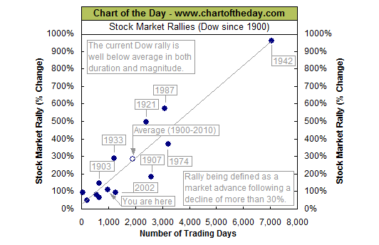
The Dow just made another post-financial crisis rally high. To provide some further perspective to the current Dow rally, all major market rallies of the last 112 years are plotted on today’s chart. Each dot represents a major stock market rally as measured by the Dow with the majority of rallies referred to by a label which states the year in which the rally began. For today’s chart, a rally is being defined as an advance that follows a 30% decline (i.e. a major bear market). As today’s chart illustrates, the Dow has begun a major rally 13 times over the past 112 years which equates to an average of one rally every 8.6 years. It is also interesting to note that the duration and magnitude of each rally correlated fairly well with the linear regression line (gray upward sloping line). As it stands right now, the current Dow rally that began in March 2009 (blue dot labeled you are here) would be classified as well below average in both duration and magnitude. However, when compared to the most recent post-major bear market rally (i.e. the rally that began in 2002), the current rally has already surpassed it in magnitude and required less time to do so.
This is an excerpt from Chart of the Day as it appeared on January 24, 2013. For updates or to read the current version of this post in its entirety, please click here.
Continue reading this post >

